Journal of Statistics Education v.2, n.2 (1994)
Copyright (c) 1994 by Michael Laviolette, all rights reserved. This text may be freely shared among individuals, but it may not be republished in any medium without express written consent from the author and advance notification of the editor.
Key Words: Statistical software; Statistical education; Graphics; Model comparisons.
Computers and software can be used not only to analyze data, but also to illustrate essential statistical topics. Methods are shown for using software, particularly with graphics, to teach fundamental topics in linear regression, including underlying model, random error, influence, outliers, interpretation of multiple regression coefficients, and problems with nearly collinear variables. Systat 5.2 for Macintosh, a popular package, is used as the primary vehicle, although the methods shown can be accomplished with many other packages.
1 Advances in computing have removed much of the computational drudgery from linear regression analysis, allowing, for instance, more extensive graphical analysis. While these advances have facilitated the analysis of data, less attention has been paid to the computer as a tool for teaching. In this article, we describe some ways in which the computer, both computationally and graphically, can help provide students with insight into basic regression concepts such as the underlying model with random error, outliers, influential observations, and interpretation of multiple regression coefficients. Emphasis is on the computer as a tool for teaching rather than analysis.
2 Most of the techniques presented here were developed in a course in regression and analysis of variance for social sciences students. The prerequisite for this course is the standard noncalculus introductory statistics course, covered by Moore and McCabe (1993), for example. The advanced mathematical level of most available regression textbooks motivated heavy emphasis on examples and graphics, but the methods presented here should also benefit more advanced students. A recent regression text by Graybill and Iyer (1994) combines careful exposition with modest mathematical prerequisites.
3 The figures accompanying this article were produced using Systat (Systat Inc. 1992), a program available on the MS-DOS, Microsoft Windows, and Macintosh platforms. Systat is also available in inexpensive student versions with accompanying textbooks by Berk (1993). Details about Systat not essential to the main points of this article can be found in Appendix 1.
4 In Section 2, we discuss use of the computer to teach the following topics: underlying model with random error, multiple regression and interpretation of coefficients, outliers, influential observations, and collinear predictor variables. Section 3 briefly discusses model fitting, writing as a component of regression analyses, and transformations. In Section 4, we summarize and conclude the discussion.
5 In this section we discuss how computers can aid students' understanding of fundamental topics in regression. For ease of exposition, procedures are described as generic step-by-step "algorithms." Details of implementation will vary with the package used.
6 The first example demonstrates the concept of underlying model, with observed data represented as random deviations from the model. The presentation uses enhancements to the basic scatterplot, such as the addition of the regression line to the plot, plots of multiple Y variables against the same X, and identification of plotted variables with distinct symbols. The basic steps involve generation of a "true" model with random responses, followed by plotting the true model and observed data on the same graph. A high-leverage case is included to facilitate later discussions of leverage and influence.
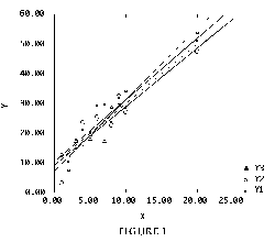 Figure 1 (4.4K gif)
Figure 1. Random Responses from Underlying Linear Regression Model. Faint dotted line is "true" model; each symbol is a random response from one of three random samples, with least-squares lines shown for each sample.
7 Figure 1 communicates several messages. First, the least-squares lines fitted from the random responses differ from the "true" line and from each other. This illustrates variability in the fitted model under repeated sampling. Also, the various least-squares lines tend to follow the point corresponding to the extreme X value, thus reflecting the high influence of this observation. Since the fitted lines "pivot" around a single point, they are spread further apart for this case. Prediction and confidence intervals on the response based on an extreme X value will have a higher margin of error than those based on more central X values.
8 With a histogram or normal probability plot, students can informally check whether the errors appear to follow the normal distribution, barring a generated outlier. In fact, generation of an outlier can illustrate that a "correct" model can still produce deviant observations, so outliers should not be arbitrarily discarded.
9 Once students have mastered the ideas of model and error from the graphs, they are ready for numerical model fitting. Systat provides regression output closely resembling most packages; sample output for a multiple regression appears in Appendix 2.
10 The numerical output can be used to review confidence intervals. Each student generates individual random responses by seeding the random number generator with a different value, fits the regression line to the generated observations, and calculates a confidence interval on the slope. The resulting intervals can be pooled to check the proportion covering the true slope.
11 New topics are effectively introduced by building on already learned topics. Consequently, multiple regression is best introduced as a series of simple regressions, an approach taken by far too few texts. Here we discuss how software can be used to teach multiple regression, following the discussion by Judd and McClelland (1989, pp. 188-200) of the Federal Reserve Board (FRB) data cited by Velleman and Welsch (1981) and reproduced in Table 1. The dependent variable is total unemployment in millions (UN); independent variables are the FRB index of industrial production (IP) and coded years (YR) from 1950 through 1959.
      UN   IP   YR
      3.1  113   1
      1.9  123   2
      1.7  127   3
      1.6  138   4
      3.2  130   5
      2.7  146   6
      2.6  151   7
      2.9  152   8
      4.7  141   9
      3.8  159  10
12 A scatterplot of UN vs. IP (Figure 2) reveals that their relationship is weak and positive, contrary to what might be expected. This analysis, however, makes no allowance for the effect of YR, so removing its effect might clarify the relationship between UN and IP. This can be accomplished by regressing UN on YR and comparing the residuals to those obtained from regressing IP on YR. The slope of the resulting least-squares line is then the partial regression coefficient for IP. Steps follow:
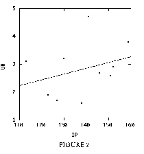 Figure 2 (2.5K gif)
Figure 2. Federal Reserve Board Data, Unadjusted Scatterplot of Unemployment (UN) vs. Industrial Production Index (IP).
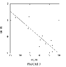 Figure 3 (2.7K gif)
Figure 3. Federal Reserve Board Data, Scatterplot of Unemployment (UN) vs. Industrial Production Index (IP), Adjusted for Effect of Year (YR).
13 The residuals from step 2-2 (2-3) comprise the trend remaining in UN (IP) after removal of its mean and the linear effect of YR. Comparison of Figure 2 with Figure 3 shows that the relationship between UN and IP is strongly negative after removal of the effect of the masking variable YR. Next, the students estimate the slope of the regression line in Figure 3 (about -0.1) and describe their conclusions, specifically the interpretation of the slope, in jargon-free English. Judd and McClelland (1989, p. 195) exemplify such a conclusion:
"Over and above the yearly changes ... unemployment decreases, on average, by [about 0.1] million workers for each unit increase in the index of industrial production."
14 Finally, the students fit the multiple regression model predicting UN from both IP and YR (see Appendix 2) and see that the regression coefficient for IP (-0.103) equals the slope of the regression line from Figure 3. The interpretation of the partial coefficient of predictor X1 as the change in Y per unit change in X1, apart from the effect of all other predictors, is now established. A small p-value for the t-test statistic or a confidence interval not covering zero indicates that X1 significantly improves the predictive ability of a model which already contains all other predictors. Figure 3 also exemplifies the partial residual plot, a useful but underemphasized analysis tool. See Belsley, Kuh, and Welsch (1980, p. 30) or Mosteller and Tukey (1977, pp. 271-279).
15 Introducing multiple regression in this manner equips the students to understand the t-statistics output for each predictor variable as a comparison between two models: a full model which includes all predictors, and a reduced model which excludes only that particular predictor.
16 Analysis of data by model comparisons also brings up a larger pedagogical issue. Regression and analysis of variance, as is well known, are simply special cases of the general theory of linear models. Most textbooks, however, are organized by what Saville and Wood (1986) describe as the "cookbook" approach. Psychologists Judd and McClelland (1989, Preface) elaborate:
"... various recipes are given in different chapters for different kinds of research designs or data structures ... cooks who rely on cookbooks don't know how to proceed when they wish to prepare a dish for which no recipe has been included. When students are confronted with data that do not fit nicely into one of the categories for which they have learned a statistical procedure, frustration and errors frequently occur."
17 Judd and McClelland follow a model-comparison approach in an integrated manner unlike that found in most statistics texts. We do not categorically endorse that text, but more emphasis should be placed on models and prediction instead of parametric estimation. As Christensen (1987, p. 93) notes,
"Models can be used for prediction. They are an end product. Parameters are an integral part of most models but they are a tool and not an end in themselves."
Also see Graybill and Iyer (1994, Preface).
18 Graphics and model-fitting can also help illustrate outliers and influence. This example uses the real data of Mickey, Dunn, and Clark (1967, Table 2), reproduced in Moore and McCabe (1993, p. 132) and Chatterjee and Hadi (1986). The data consist of aptitude test scores (SCORE) from 21 children, to be predicted from the age in months (AGE) at which the child speaks his/her first word. We discuss influence first, followed by outliers.
      CHILD  AGE  SCORE  CHILD  AGE  SCORE
        1     15    95     12    9     96
        2     26    71     13    10    83
        3     10    83     14    11    84
        4     9     91     15    11   102
        5     15   102     16    10   100
        6     20    87     17    12   105
        7     18    93     18    42    57
        8     11   100     19    17   121
        9     8    104     20    11    86
        10    20    94     21    10   100
        11    7    113
19 Once again, we begin with graphics. The following algorithm illustrates influence by graphically fitting a model with, then without, a high-leverage observation to illustrate the shift in the fitted model.
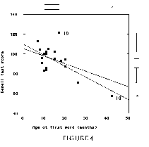 Figure 4 (3.3K gif)
Figure 4. Scatterplot of Aptitude Score vs. Age at Which First Word Spoken; Data from Mickey, Dunn, and Clark (1967). Individual variables are shown as marginal boxplots; least-squares lines are shown with and without influential Case 18.
20 The boxplots from step 3-1 (shown in the margins of Figure 4) show Case 18 (AGE = 42 months) as an extreme outlier in the case ages. In the scatterplot, the clear shift in the fitted line indicates the influence of Case 18 on the fitted model. This leads to an informal definition of an influential observation as one which, if removed, "would markedly change the position of the regression line" (Moore and McCabe 1993, p. 134). It also leads into a discussion of whether the child of Case 18 belongs in the same study population as the rest of the children.
21 Figure 4 also shows one case far from both fitted lines. Using scatterplot brushing or another method, we identify this observation as Case 19. The distance between this point and the fitted line indicates that Case 19 does not fit the same pattern as the rest of the data, and will therefore produce a large residual. To formalize the effect of outliers, we fit a model which effectively makes a "special case" of the suspect observation. This procedure sets up a comparison between two models: a full model which distinguishes Case 19, and a reduced model which does not.
22 Since all values but one of the CASE19 variable are zero, the difference between the predictions of the two models is due entirely to Case 19. A significant regression coefficient for Case 19 means that the full model is required to accurately predict Case 19. The practical conclusion is that Case 19 does not fit the pattern of the rest of the data, and is therefore an outlier. The t-statistic for this comparison, of course, is the externally studentized residual.
23 The model-comparison approach, using the model fit in step 4-9, works particularly well for explaining outliers. My last regression class had great difficulty understanding the externally studentized residual until they saw a demonstration based on Algorithm 4. Of course, students need to be cautioned that although the notion of outliers can be formalized as a test, externally studentized residuals work better as an informal diagnostic rather than as a series of formal tests ( Myers 1990, p. 227).
24 Software has the distinct advantage of enabling students to see results for themselves, rather than trying to absorb abstract concepts solely through lectures. Here, following the discussions of collinearity by Myers (1990, pp. 125-127) and Mosteller and Tukey (1977, pp. 280-283), we discuss how 3-D graphics can be used to illustrate the statistical effects of collinear predictor variables.
25 This discussion can be motivated by a simple example, such as trying to estimate some response from length measured both in feet and yards. Practically, the two variables are redundant because they measure the same quantity, but on different scales. The statistical consequences can be illustrated using the data in Table 3, which contains artificial predictor variables X1, X2 (nearly collinear) and X3, X4 (orthogonal). Statistical consequences can be investigated using Algorithm 5. This algorithm generates random responses from an underlying model, similar to Algorithm 1, then fits the least-squares surface. Models fitted with the nearly collinear predictors show the wide variance in estimated model coefficients, while models using the orthogonal predictors are stable.
       X1    X2    X3    X4
      10.0  10.0  10.0  10.0
      11.0  11.4  10.0  10.0
      11.9  12.2  10.0  15.0
      12.7  12.5  10.0  15.0
      13.3  13.2  15.0  10.0
      14.2  13.9  15.0  10.0
      14.7  14.4  15.0  15.0
      15.0  15.0  15.0  15.0
27 Repeating Algorithm 5 with orthogonal predictors X3 and X4 illustrates the stability of regression estimates in both steps 5-5 and 5-7. Figure 5 shows that the least-squares surface (or "table") constructed from the collinear predictors rests on unstable, nearly linear "legs," while the surface for the orthogonal predictor variables is stable.
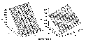 Figure 5 (9.6K gif)
Figure 5. 3-D Plots of Random Responses vs. Collinear Predictors (left) and Orthogonal Predictors (right). Least-squares planes are added.
28 Numerical estimation of the two models fitted in step 5-5 will show that the estimated coefficients differ widely from each other and from the "true" model. This illustrates the inflated variance estimates due to the collinear predictors (correlation coefficient = 0.992). The models resulting from step 5-7, combining X1 and X2, show that X1 and X2 are essentially the same predictor, since the regression coefficients are much more stable between the two models. Variance inflation factors can now be introduced.
29 In this section, we discuss some other ways in which the computer can enhance teaching of regression, although these are not all limited to regression. They include interactive model-fitting, transformations, and report writing.
30 Once the notions of model, error, and diagnostics have been covered, students are then prepared to identify a valid and viable regression model from data. Since the regression techniques covered so far have been introduced with heavy emphasis on graphics, continuing this emphasis in the model-fitting process makes sense, so we recommend the interactive procedure suggested by Chatterjee and Price (1991, pp. 250-251). The first steps in this procedure are examination of individual variables and pairwise scatterplots, made easy by packages which provide scatterplot matrices, such as Systat.
31 Graphics can also aid in assessing whether transformations are appropriate. The most common and useful of these is the log transformation, recommended by Chatterjee and Price (1991, p. 250) to induce symmetry and reduce skewness. Since some students are not familiar with logarithms, graphs with a log-scaling option help explain the concept as a change from an additive scale to a multiplicative one. For instance, Chatterjee and Price (1991, pp. 36-42) provide an example in which the number of bacteria surviving after X-ray exposure is regressed against time. The additive scale (Figure 6, left) clearly shows that a straight line is an inadequate fit to the data. Logging the scale (Figure 6, right) clearly shows the appropriateness of the log transformation (to base 2 for convenience). Moore and McCabe (1993, pp. 147-156) provide one of the best and most straightforward explanations of log transformations. Log-scaled graphs are also convenient for analysis, since the user can assess the effect of a log transformation before constructing a new variable from the data.
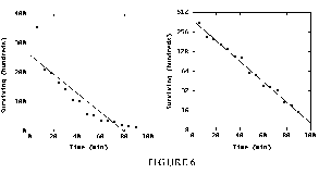 Figure 6 (4K gif)
Figure 6. Plot of Surviving Bacteria vs. Time, on Additive Scale (left) and Multiplicative Scale (right). Scale in right-hand plot is logged to base two.
32 Radke-Sharpe (1991) has advocated increased emphasis on writing in statistics courses, arguing that one goal of a statistics curriculum is "to teach the student to think critically in designing a statistical strategy." Accordingly, students were required to prepare reports on their analyses and include graphics and analytic text with their comments and conclusions. This procedure works best on the Windows and Macintosh platforms, in which the user can generate graphs and analysis from a statistical package, then paste results directly into a word processor document. While all packages can print results directly, the word processor more effectively emphasizes the importance of good writing and presentation.
33 Textbooks on statistics mostly emphasize the theory behind statistical procedures, while books on statistical software, such as Berk (1993), emphasize the workings of the software and its use for analysis. This article has shown how the gap between theory and practice can be bridged by using software to illustrate the underlying concepts, rather than only as an analysis tool. Software as a teaching tool benefits students by replacing abstract lectures with concrete examples, thus contributing to greater understanding and better analysis.
Systat (Systat, Inc. 1992) is a full-featured statistics and graphics package which runs on the MS-DOS, Microsoft Windows, and Macintosh platforms. Other Systat, Inc. products include Fastat (includes all but the most advanced Systat functions), Mystat (a small version of Systat intended for instructional use), and Student Systat (similar in scope and price to student versions of such packages as Minitab). Until the recent publication of Student Systat and its accompanying books (Berk 1993), no instructional materials independent of, and specifically for, Systat were available to our knowledge. All versions of Mystat are now accompanied by full-length books (Hale 1990, Steagall 1994) which replace terse booklets formerly provided by Systat, Inc. In September 1994, all Systat, Inc. products were acquired by SPSS, Inc.
The following remarks refer primarily to the Macintosh version of Systat, although the Windows version runs very similarly. For a comparative overview of Systat and other Macintosh statistics packages, such as Data Desk (Velleman 1992) and StatView (Abacus Concepts 1992), see Best and Morganstein (1991). For an overview of MS-DOS and Windows packages, see Canter (1993) and accompanying reviews.
Systat data entry is done in a spreadsheet-like editor, but variable names are limited to eight characters and transformations are static, so changing any data requires repeating all analyses. Graphic and numerical procedures are found under separate menus (Graph and Stat), and respective output appears in separate windows, called "View window" for graphics and "Analysis window" for numerical results. Data for auxiliary analyses, such as residuals, are saved in files separate from the original data, and only one data file can be open at a time. Execution of most procedures is straightforward: the user selects a procedure from the Stat or Graph menu, then selects the variables for analysis and any fine-tuning options desired.
Systat's suite of graphics features is widely regarded as among the most extensive available for microcomputer statistics packages. Its scatterplot smoothing and brushing, multiple overlaid graphs, and 3-D plots, among other features, can help to clarify many fundamental topics in regression analysis. All graphics accompanying this article were produced using Systat.
Canter and Kadushin (1993) note that Systat "combines exceptional strengths with some surprising weaknesses," and we agree. From a statistical viewpoint, Systat's most glaring weakness is its exclusion of built-in procedures for confidence and prediction intervals. Prediction and confidence intervals for regression, for example, require hand calculation using the leverages and the residual mean square. If intervals are desired for predictor values not included in the data, those values must be added to the data set with a missing response to obtain the necessary leverage. The omission of interval procedures will become even more problematic in view of the growing trend toward emphasis on interval estimation rather than traditional hypothesis testing. See, for example, Vardeman (1994) or Graybill and Iyer (1994).
Systat's practice of saving results of auxiliary analyses to separate files can at times hamper teaching by requiring sometimes elaborate file manipulations, thus forcing students to concentrate on the mechanics instead of the point of the lesson. For example, the multiple regression exercise described in Algorithm 2 requires the following steps:
 Figure 3 (2.7K gif)
Figure 3. Federal Reserve Board Data, Scatterplot of Unemployment (UN) vs. Industrial Production Index (IP), Adjusted for Effect of Year (YR).
The multiple file openings and savings require the instructor to provide especially careful and detailed instructions.
When saving residuals, the user can specify one of several options, including saving of partial residuals or model variables. Only one of these options can be chosen at a time, so having both partial residuals and model variables requires that the model be fitted twice. Also, only the model variables are saved in the residual file, so plotting residuals against a lurking variable requires some manipulation to place the residuals in the original datafile.
For the demonstration of influence in Algorithm 4, Systat's "Redo Last Analysis" feature can be used to good advantage. The scatterplot is drawn, the influential observation is cut to the Clipboard, then "Redo Last Analysis" is used to redraw the plot, overlaid on the plot using all observations.
Another logistical point warrants note: Systat can save text and graphics to disk, but in files separate from the original data. Data Desk, by contrast, saves data and all analysis results in a single file. Setting up separate folders for each analysis can help to keep track of files. The saved graphics and results can be easily inserted into documents from most word processors. Saving the results to disk also means that Systat and the word processor need not run simultaneously, thus saving memory.
In summary, Systat's graphs comprise its greatest strength. Its primary weaknesses, for both teaching and analysis, include its exclusive reliance on hypothesis testing and its awkward file handling.
DEP VAR: UN   N: 10     MULTIPLE R: .930    SQUARED MULTIPLE R: .866
ADJUSTED SQUARED MULTIPLE R: .827  STANDARD ERROR OF ESTIMATE: 0.401

VARIABLE  COEFFICIENT  STD ERROR  STD COEF  TOLERANCE   T   P(2 TAIL)

CONSTANT    13.454      2.484       0.000      .       5.417    0.001
IP          -0.103      0.022      -1.562     0.179   -4.772    0.002
YR           0.659      0.104       2.070     0.179    6.322    0.000

                           ANALYSIS OF VARIANCE

SOURCE     SUM-OF-SQUARES    DF    MEAN-SQUARE    F-RATIO       P

REGRESSION      7.250         2        3.625      22.530       0.001
RESIDUAL        1.126         7        0.161

WARNING: CASE 1 IS AN OUTLIER     (STUDENTIZED RESIDUAL = 3.619)

DURBIN-WATSON D STATISTIC    1.328
FIRST ORDER AUTOCORRELATION   .126
Abacus Concepts (1992), StatView 4.0 (Macintosh software), Berkeley, CA: Author.
Belsley, D.A., Kuh, E., and Welsch, R.E. (1980), Regression Diagnostics: Identifying Influential Data and Sources of Collinearity, New York: Wiley.
Berk, K.N. (1993), Data Analysis with Student SYSTAT (published in separate editions for MS-DOS, Microsoft Windows, and Macintosh platforms), Cambridge, MA: Course Technology.
Best, A.M., and Morganstein, D. (1991), "Statistics Programs Designed for the Macintosh: Data Desk, Exstatix, Fastat, JMP, StatView II, and Super ANOVA," The American Statistician, 45, 318-337.
Canter, S. (1993), "Stat of the Art" (with various reviews), PC Magazine, May 11, 227-287.
Canter, S., and Kadushin, C. (1993), "Systat for DOS, Systat for Windows," PC Magazine, May 11, 284-287.
Chatterjee, S., and Hadi, A.S. (1986), "Influential Observations, High Leverage Points, and Outliers in Linear Regression" (with discussion), Statistical Science, 1, 379-416.
Chatterjee, S., and Price, B. (1991), Regression Analysis by Example (2nd ed.), New York: Wiley.
Christensen, R. (1987), Plane Answers to Complex Questions: The Theory of Linear Models, New York: Springer-Verlag.
Graybill, F.A., and Iyer, H.K. (1994), Regression Analysis: Concepts and Applications, Belmont, CA: Duxbury Press.
Hale, R.L. (1990), MYSTAT Statistical Applications (in separate editions for MS-DOS and Macintosh platforms), Cambridge, MA: Course Technology.
Judd, C.M., and McClelland, G.H. (1989), Data Analysis: A Model-Comparison Approach, San Diego, CA: Harcourt Brace Jovanovich.
Mickey, M.R., Dunn, O.J., and Clark, V. (1967), "Note on the Use of Stepwise Regression in Detecting Outliers," Computers and Biomedical Research, 1, 105-111.
Moore, D.S., and McCabe, G.P. (1993), Introduction to the Practice of Statistics (2nd ed.), New York: W.H. Freeman.
Mosteller, F., and Tukey, J.W. (1977), Data Analysis and Regression, Reading, MA: Addison-Wesley.
Myers, R.H. (1990), Classical and Modern Regression with Applications (2nd ed.), Boston: PWS-Kent.
Radke-Sharpe, N. (1991), "Writing as a Component of Statistics Education," The American Statistician, 45, 292-293.
Saville, D.J., and Wood, G.R. (1986), "A Method for Teaching Statistics Using N-Dimensional Geometry," The American Statistician, 40, 205-214.
Steagall, J.W. (1994), MYSTAT Statistical Applications (Windows edition), Cambridge, MA: Course Technology.
Systat, Inc. (1992), SYSTAT 5.2 (Macintosh software), Evanston, IL: Author.
Vardeman, S.B. (1994), Statistics for Engineering Problem Solving, Boston: PWS Publishing.
Velleman, P.F. (1993), Data Desk 4.0 (Macintosh software), Ithaca, NY: Data Description.
Velleman, P.F., and Welsch, R.E. (1981), "Efficient Computing of Regression Diagnostics," The American Statistician, 35, 234-242.